

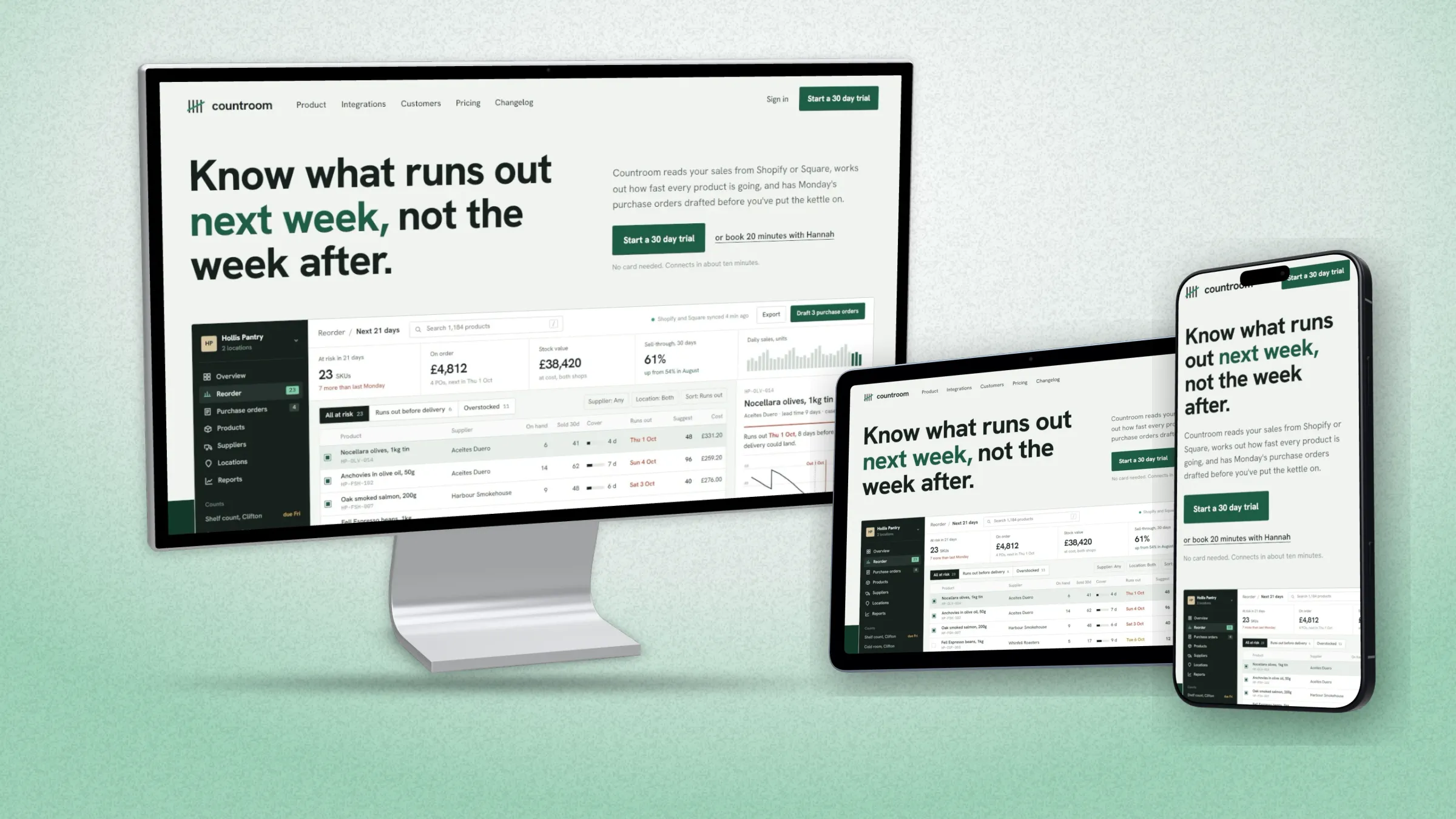
A responsive mockup puts the same site on a laptop, a tablet and a phone in one picture. In DudeShots you capture the site once from its address, add each device to the canvas, pick an arrangement and export. It takes about two minutes. Here's how, and what makes the difference between a set that looks planned and three devices that happen to share a picture.
What you need
- The desktop layout. A screenshot at a laptop width, or just the page's address.
- The phone layout. A phone screenshot of the same page. If you start from the address, the studio fetches this for you.
- A tablet layout, only if you have one. Many sites show the desktop layout on a tablet, and a smaller copy of the same thing adds nothing.
Step by step
1. Capture the site
Open the studio. In Shot, paste the address and capture. Viewport, the visible first screen at 1440 px wide, is free. Folds, sections and full page are Pro. More on this on the URL to screenshot page.
2. Pick the first device
In Device, pick the big one: MacBook, Monitor or Browser. Choose Flat or 3D under the tiles. 3D devices turn like real objects when you drag on the canvas.
3. Add the others
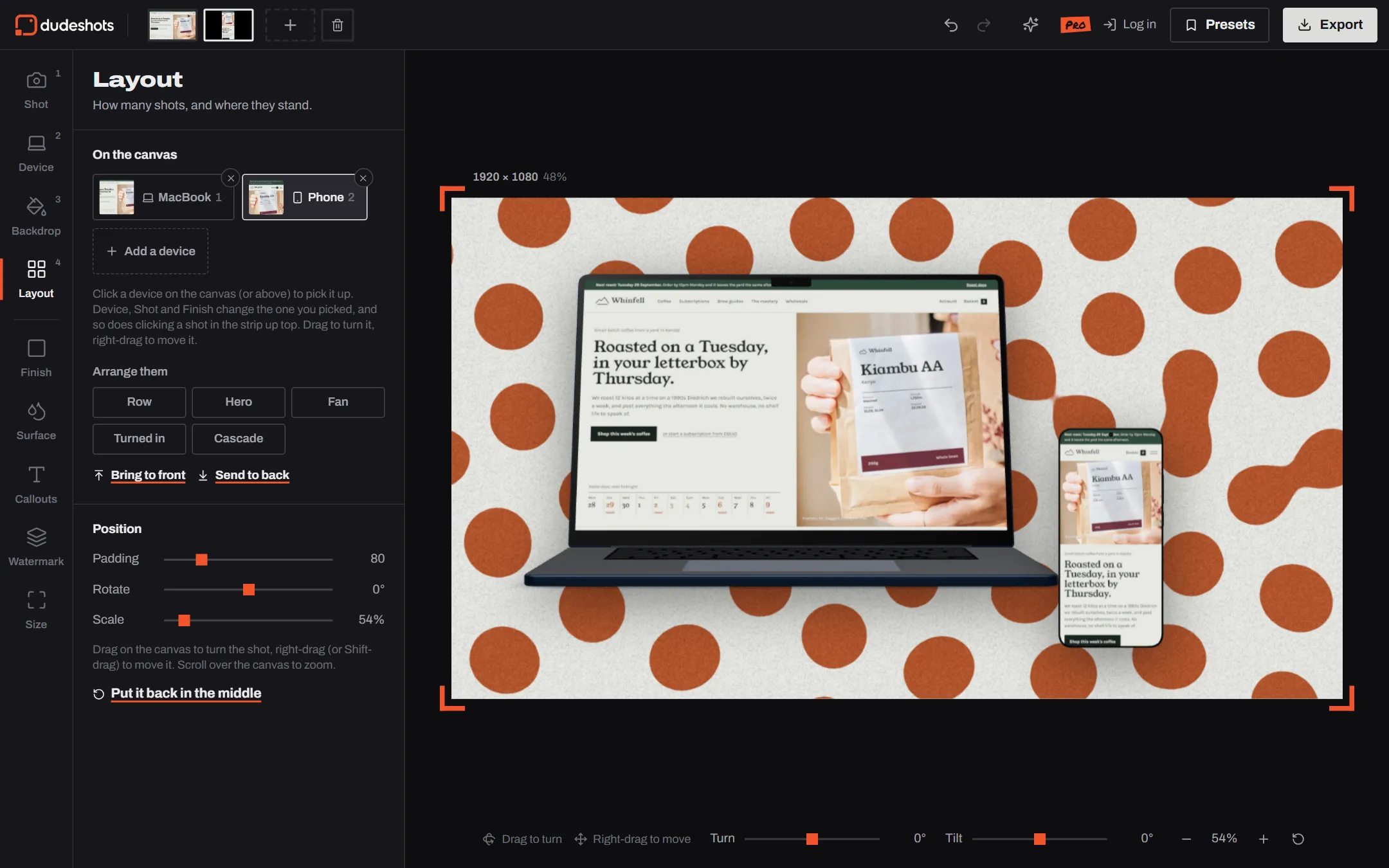
Open Layout. At the top, On the canvas lists what's there. Click Add a device and pick Phone, then again for Tablet if you want one. Each new device takes the next shot in the strip. When a phone shows a page you captured from its address, the studio grabs the phone layout of that page and swaps it in.
4. Arrange them
Under Arrange them, pick one of five:
| Arrangement | What it does | Good for |
|---|---|---|
| Row | Side by side, the same height | Comparing layouts, case studies |
| Hero | The biggest in front, small ones in front of it | Laptop and phone, the classic pair |
| Fan | Overlapping, fanned out | Several phones, app screens |
| Turned in | The outer ones turned to face the middle | Three devices with a centre piece |
| Cascade | Stepped back, one behind the other | Showing depth, a series of pages |
Then fine-tune. Click a device to pick it up: Device, Shot and Finish now change only that one. Drag to turn it, right-drag or Shift-drag to move it, and use Bring to front or Send to back when they overlap.
5. Backdrop, size and export
One backdrop behind everything is what makes it read as a set. "Made for your shot" builds one from the site's own colours. Pick the Size for where it's going (see the FAQ below), then Export: PNG, JPEG or WebP, 2× on Free, up to 3× on Pro.
Five things that make it look right
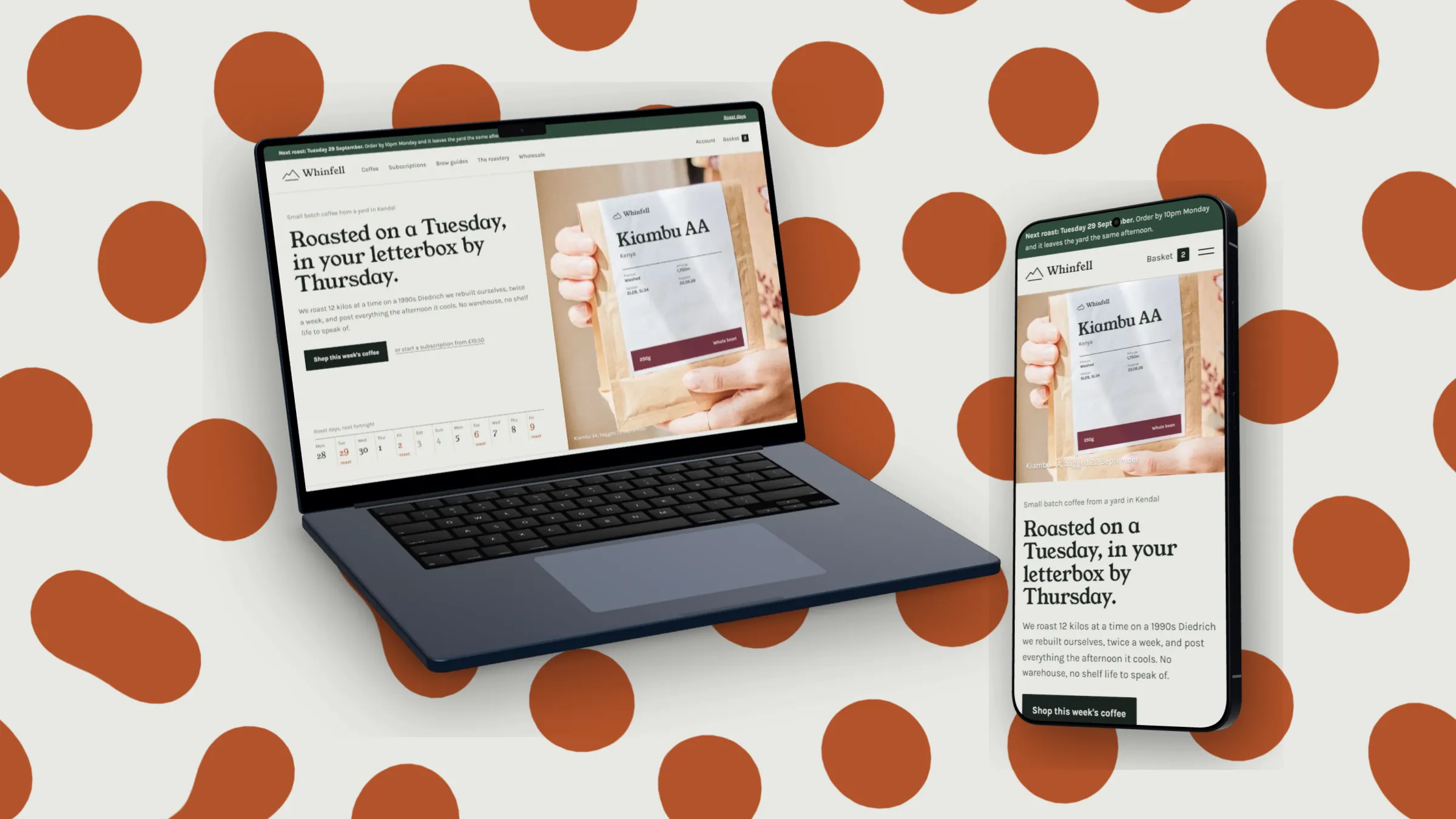
- Same page, same moment. Every device shows the same page scrolled to the same place. Mixing pages reads as a collage.
- Real proportions. A phone next to a laptop should be phone-sized, maybe a touch bigger. A giant phone looks like a mistake.
- Let them overlap a little. A phone just in front of the laptop's corner ties the two together.
- Turn them towards each other. Devices facing the middle hold the eye in the picture.
- One backdrop, one light. Every device gets the same shadow direction, so it looks like one photograph.
On Free
Several devices on one canvas is part of Pro (£5 a month, no trial). On Free you can build the whole set, arrange it and see it; the export carries a small "preview" tape across the corner. If you'd rather stay on Free, frame each device on its own with the None backdrop, export PNGs with transparency, and place them together in your own design tool. See pricing for the full list.
Where to use it next: as the first image of a Product Hunt gallery, a Dribbble shot, or your landing page hero. Individual devices are on the MacBook, phone and iPad pages.