

For a full-width hero, make the image 1920 × 1080 (16:9). For a product shot in a column, make it twice the width it's shown at. Give mobile its own taller crop, export WebP, and keep the headline in the page rather than in the picture. There's no official hero size; these are the numbers that hold up on real screens.
Hero image sizes at a glance
| Hero type | Export size | Why |
|---|---|---|
| Full-width background | 1920 × 1080 | 16:9 covers most laptop and desktop screens |
| Full width, large screens | 2560 × 1440 | Only if it has to stay sharp on big monitors |
| Short banner | 1920 × 700 or so | Leaves room for the content below the fold |
| Product shot in a column | 2 × the column width | A 640 px column wants a 1280 px image |
| Mobile crop | About 860 px wide, 4:5 | Phones are 360 to 430 px wide at 2× or 3× |
Two kinds of hero
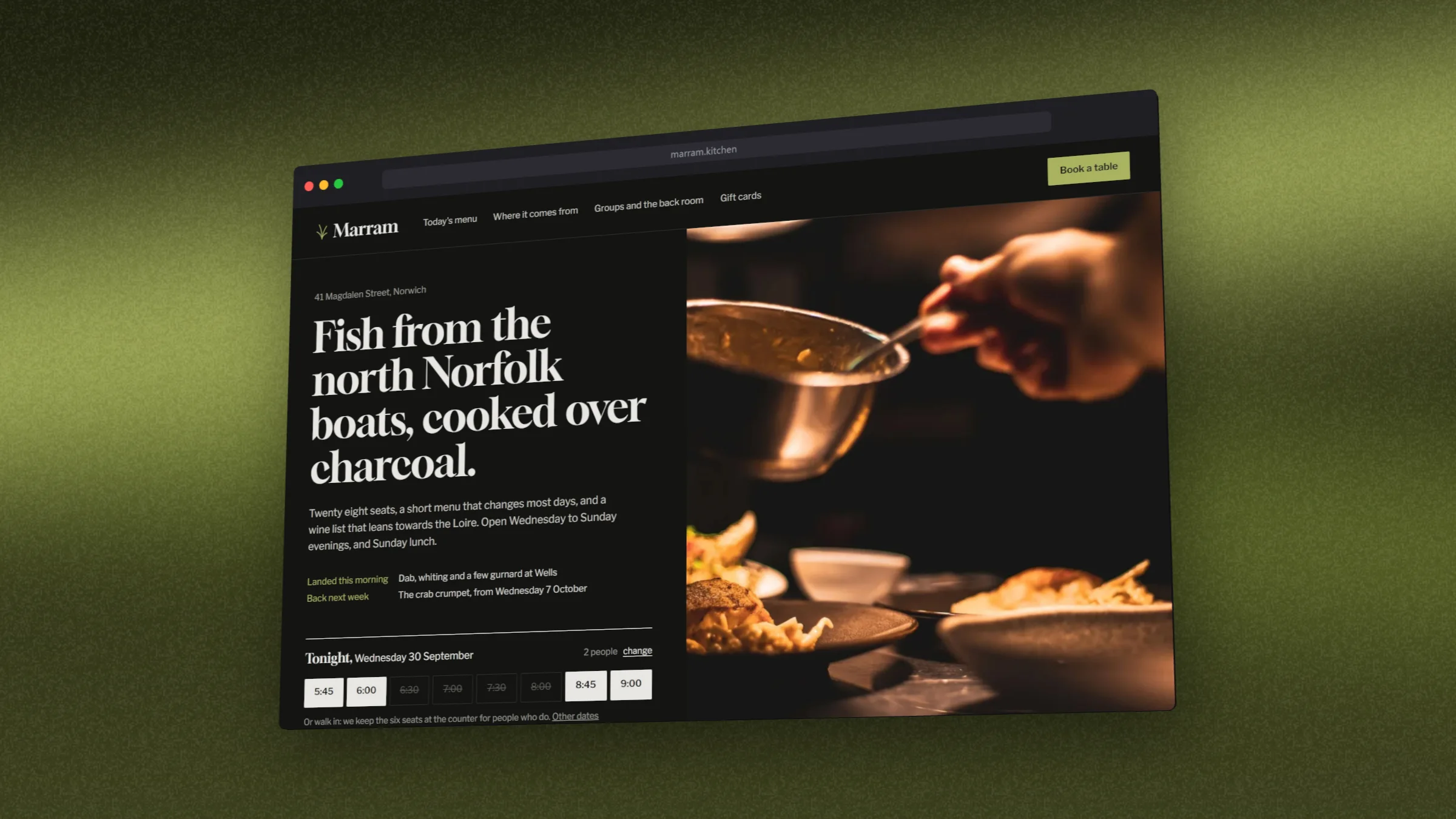
A full-bleed picture
The image fills the whole band and the headline sits on top of it or beside it. For a product, that means a screenshot in a device on a backdrop, with a quiet area where the words go. Here the window sits to the right, leaving the left side calm.
A product cut-out on the page's own colour
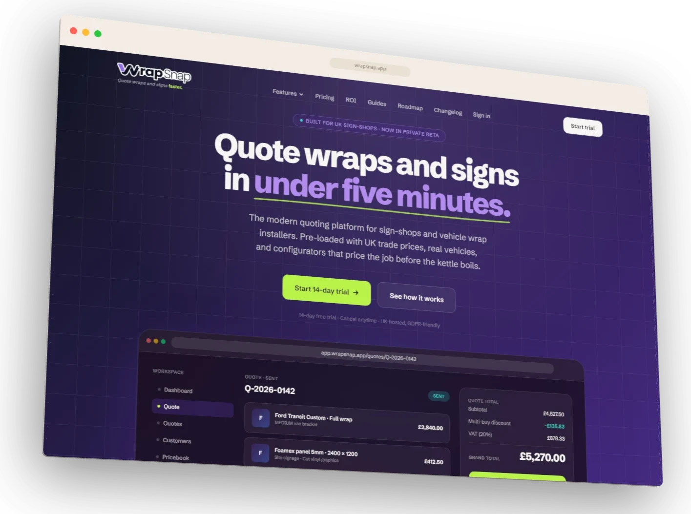
The other common pattern is a product shot with no background at all, sitting on the page's own colour next to the headline. Export it with a transparent background and the page shows through. It looks built into the page rather than pasted on, and it's usually a smaller file.
Rules that keep a hero fast and sharp
- Export at 2× the displayed size, then let
srcsetserve a smaller copy to smaller screens. - Use WebP. It keeps transparency and is far smaller than PNG for the same picture.
- Set width and height on the img tag so the page doesn't jump when it loads.
- Don't lazy-load it. The hero is usually the largest thing on first paint; lazy-load what's below it.
- Keep text out of the picture. HTML text is readable by search engines and screen readers, and sharp at any size.
- Make a separate mobile crop. A 16:9 laptop shrunk to 390 px wide is too small to read.
What to put in it
The screen people will use most, with real content: a dashboard with numbers in it, a shop with products, not an empty state. Crop to the part that explains the product. If it works on phones too, show a laptop and a phone together; the responsive mockup guide shows how.
How to make a hero image in DudeShots
- Size. In the studio, go to Size, then Web & Marketing, and pick Hero Banner (1920 × 1080).
- Shot. Paste your live address to capture it (the viewport capture is free), or drop in a screenshot.
- Device. Browser or MacBook. Flat is free; 3D is Pro, and Free can try it with a preview tape.
- Backdrop. Pick a colour from your shot, or None for a transparent cut-out.
- Layout. Use Scale and Padding to leave space on one side for the headline. Drag on the canvas to turn the device.
- Export. WebP at 2×. For the mobile crop, switch Size to 4:5 Portrait or pick a phone, and export again.
More on the frames: browser mockups and MacBook mockups. The same picture, cropped to 1200 × 630, makes your share image.
Sources: no platform sets a hero size. The figures above follow common screen sizes and web.dev's guidance on Largest Contentful Paint and responsive images, checked September 2026.