

Make email newsletter images 600 px wide (the width of most email templates): 600 × 200 for a header, 600 × 300 to 600 × 400 for a hero or product banner, exported at 2× (1200 px wide) and kept under about 200 KB. If your template is 660 px wide, as in Mailchimp's new builder, scale those up to 660. Below are the sizes for each part of an email, the format and file size rules that stop images breaking in Outlook and Gmail, and how to turn a screenshot of your product into a banner in DudeShots.
Email newsletter image sizes at a glance
Email has no official image size. What sets it is the template: the content column is a fixed width, and every image is either that width or a fraction of it. 600 px has been the usual width for years because it fits the reading pane of desktop email apps and scales down cleanly on phones.
| Image | Shown at (px) | Export at 2× (px) |
|---|---|---|
| Header or masthead | 600 × 200 | 1200 × 400 |
| Hero or product banner | 600 × 300 to 600 × 400 | 1200 × 600 to 1200 × 800 |
| Full-width image in the body | 600 wide, any height | 1200 wide |
| Two-column image | about 280 to 300 wide | 560 to 600 wide |
| Three-column image | about 180 to 190 wide | 360 to 380 wide |
| Logo in the header | about 150 to 200 wide | 300 to 400 wide |
| Mailchimp new builder, full width | 660 wide | 1320 wide |
Column images are a little narrower than an exact half or third because templates add padding between columns. Check the real width in your template (most editors show it when you select an image block) before you export.
The width comes from your template
Mailchimp's classic templates are 600 px wide and its new builder templates are 660 px; its help pages suggest uploading images between the display width and double it (600 to 1200 px in classic, 660 to 1320 px in the new builder), and it resizes images to fit the block. Most other email tools default to 600 or 640. Whatever the number, design to that width and export at twice it.
On a phone the column shrinks to the screen, roughly 320 to 430 px, so a 600 px image is shown smaller, not cropped. That's why text inside an email image needs to be large: a 16 px caption at 600 px becomes about 9 px on a narrow phone. If people need to read it, put it in the email as live text instead.
Email header size
The header is the strip at the top with your logo or the issue name. 600 × 200 (3:1) is the common size, and anything between 600 × 150 and 600 × 250 works. Keep it short: on a phone, a tall header pushes the first line of your email below the fold, and the preview pane in desktop apps shows only the top few hundred pixels. A header made from your product, rather than a stock photo, tells readers straight away who the email is from.
Hero and product banner size
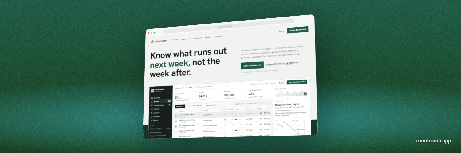
The hero is the first big picture in the email, the one that carries the offer or the new feature. 600 × 300 (2:1) to 600 × 400 (3:2) is the usual range. For a product or a launch, a screenshot of the new screen in a device frame works better than a flat crop: readers can tell at a glance it's software, and the device gives a small UI a clear edge on a busy inbox background.
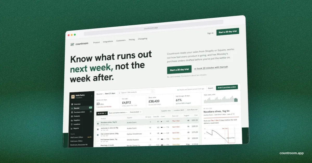
Put the offer and the button below the image as live text and a real button, not inside the picture. Many readers open email with images off or still loading, and an image with the sale price in it shows them nothing.
File format and file size
- JPEG for photos, product pictures and anything with a gradient or textured backdrop. It is usually the smallest file. A quality of about 70 to 80 looks clean at email sizes.
- PNG for logos, icons and anything that needs a transparent background or hard-edged text.
- GIF for a short, simple animation. Older Windows versions of Outlook show only the first frame, so make that frame work on its own.
- Avoid WebP and SVG. Support across email apps is uneven, and desktop Outlook on Windows does not show SVG.
- Keep each image under about 200 KB, and well under 1 MB, Mailchimp's suggested upload limit. Several large images can make an email feel slow on mobile data.
Gmail clips a message and shows a “View entire message” link once its HTML passes about 102 KB. That limit is for the code, not for linked images, so a few large pictures won't trigger it. Images pasted into the HTML as base64 do count, which is why email tools host images and link to them.
Make images sharp on retina screens without breaking Outlook
- Export the image at twice its display width, for example 1200 × 400 for a 600 × 200 header.
- Set the display width as an HTML attribute on the image:
width="600". - Also set it in the inline style,
style="width:100%; max-width:600px; height:auto;", so it shrinks on phones. - Give every image alt text that makes sense on its own, for readers who have images turned off.
The width attribute matters most for desktop Outlook on Windows. Without it, Outlook can show a 2× image at its full pixel size, so a 1200 px image spills far past a 600 px email. Email builders such as Mailchimp set the attribute for you; if you write the HTML yourself, add it to every image.
How to make an email banner from a screenshot in DudeShots
- Size. In the studio, open Size, then Web & Marketing, and pick Email Banner (600 × 400) or Email Header (600 × 200). For a 660 px template, use Custom size.
- Shot. Drop in a screenshot of the new screen, or paste your site's address to capture it from the URL.
- Device. A browser window for a web app, a phone for a mobile app, or no frame at all for a cleaner look. Flat frames are free; 3D frames are Pro, and a new account gets a free Pro week to try them.
- Backdrop. Pick colours from your screenshot so the banner matches the brand, and keep it calm: a busy backdrop turns to noise at 600 px.
- Fit. Make the device fill most of the canvas. Small details vanish when a phone shows the image 350 px wide, so crop to the part of the screen the email is about.
- Export. JPEG at 2×, which gives a 1200 × 800 file for the banner. Lower the quality slider if the file comes out much over 200 KB. Upload it and set the image to 600 px wide in your email tool.
If the email links to a blog post or launch page, the same picture at 1200 × 630 makes its share image, and at 1920 × 1080 the page's hero image. Change the Size and export again; the device and backdrop stay as they are. For the posts that go out with the email, the social media image sizes guide has every network's size.
Check it before you send
Send a test to yourself and open it on a phone, in Gmail on the web and, if your readers use it, in desktop Outlook. Look for three things: the header isn't taller than it needs to be, every image fits the column, and the email still makes sense with images turned off. Black Friday and launch emails go out in large numbers at once, so a broken image costs more than usual: test the week before, not the morning of.
Sources: Mailchimp help pages on template widths and image recommendations (600 px classic, 660 px new builder, 1 MB suggested limit). Gmail does not publish its clipping limit; the 102 KB figure is the one email providers observe. Checked November 2026.