

YouTube now recommends 3840 × 2160 pixel thumbnails: 16:9, at least 640 pixels wide, as JPG, PNG or GIF, up to 50 MB from a computer or 2 MB from the mobile app. The old 1280 × 720 still works, but it looks soft on the TV screens where a growing share of YouTube is watched. This guide covers the numbers, then how to make a thumbnail for a product demo, tutorial or launch video from a screenshot of your app or site.
YouTube thumbnail specs
| Spec | Value |
|---|---|
| Recommended size | 3840 × 2160 px |
| Minimum width | 640 px |
| Aspect ratio | 16:9 |
| Formats | JPG, PNG, GIF |
| File size | Up to 50 MB on desktop, 2 MB on mobile |
| Who can upload | Verified accounts |
These are from YouTube's help page on custom thumbnails. The 50 MB limit arrived with the move to 4K thumbnails; before that it was 2 MB everywhere, and the phone app still caps it there. So if you upload from your phone, export a JPEG. A 4K PNG with a screenshot in it is often bigger than 2 MB.
Your thumbnail shows at many sizes: large on a TV, small in the list of suggested videos beside another video, and smaller still on a phone. Design for the smallest one. If the words and the product read at a few centimetres across, the 4K version will look sharp everywhere else.
What a product video thumbnail needs
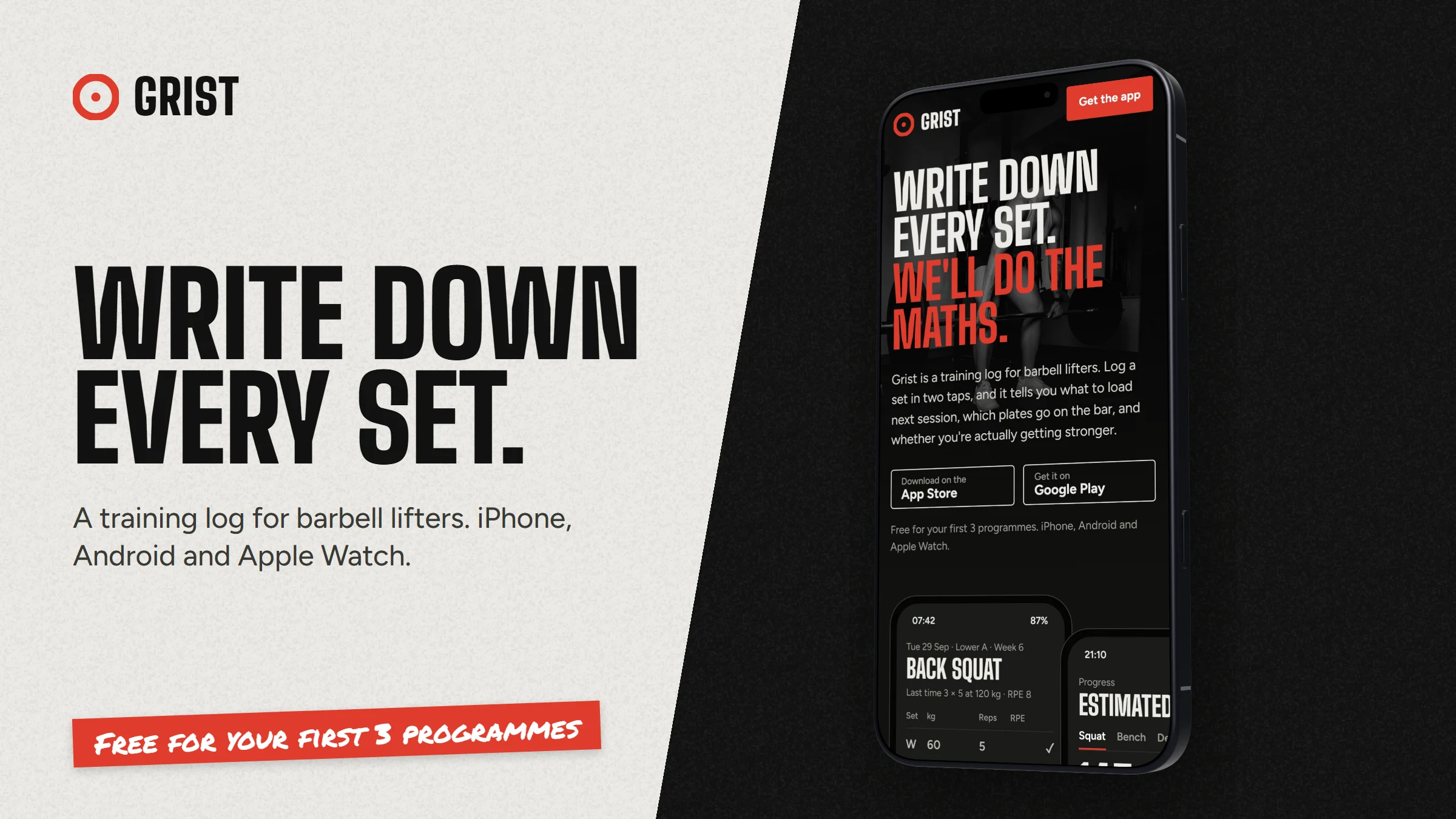
Most thumbnail advice is written for faces and reactions. Videos about software are different: the viewer wants to know which product it is and what they will learn. A layout that works again and again:
- The product, big. A phone or browser window filling a good part of the frame, showing the screen the video is about. Not a whole dashboard shrunk to nothing.
- Three to five words. The outcome, not the title: "Write down every set", "Invoices in 2 minutes". Thick type, high contrast.
- One colour that belongs to you. The same brand colour on every thumbnail makes a series recognisable in a sidebar.
- Words on one side, product on the other. A split layout reads at small sizes where an overlap turns to noise.
- Nothing important bottom right. YouTube puts the video length there, over your image.
Making one in DudeShots
- Add the screen. In the studio, drop in a screenshot from the video, or paste your site's address in Shot to capture it. Pick the screen the video is actually about.
- Set the size. In Size, under Social Media, pick YouTube Thumbnail (1280 × 720). Designing at that size keeps text sizes sensible, and the export can scale it up (step 6).
- Pick a device. A phone for an app, a browser window or MacBook for a web product. Turn it a little so it faces the words; with a 3D device you drag on the canvas to turn it. More on frames on the phone mockup and browser mockup pages.
- Add the words. In Callouts, add a Headline and type your three to five words. Drag it to the empty side and scale it up until it fills that side. A Tape sticker works for a short label like "Part 2" or "New"; keep it out of the bottom right.
- Colour the backdrop. In Backdrop, start from your screenshot's own colours so the thumbnail matches the product, then pick a quiet style such as Studio light or a soft gradient. Busy patterns fight with the text at small sizes.
- Export. Choose JPEG. At 3× the file is 3840 × 2160, YouTube's recommended size; 3× is part of Pro. On Free, export at 2× for 2560 × 1440, or set a custom size of 3840 × 2160 in Size and export at 1×.
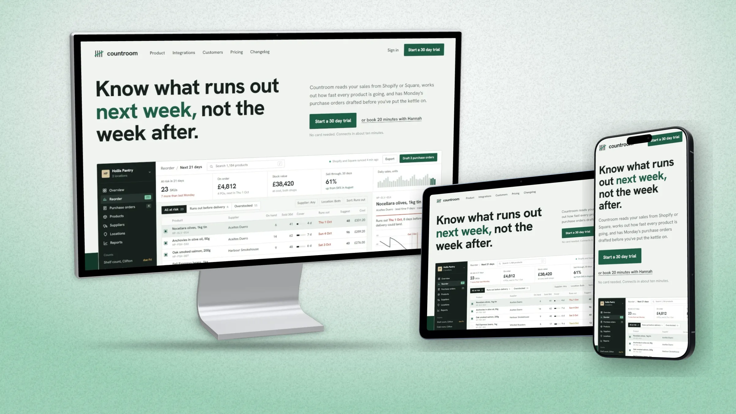
To make the next video's thumbnail, swap in the new screenshot and retype the headline. The device, angle, backdrop and placement all stay, so a series looks like a series.
Test it before you publish
Shrink the export to about 320 pixels wide and look at it next to a few other videos in your niche. If you cannot read the words or tell what the product is, make the text bigger and the device closer. Once the video is live, YouTube Studio's Test & Compare can run up to three thumbnails against each other and keep the one that earns the most watch time.
The same 16:9 setup also gives you a landing page hero; switch Size to OG Image for the share image when you post the video link.