

Make README screenshots about 1600 px wide and display them at 800 px. GitHub's README column is 838 px wide on a desktop, so 800 fits cleanly, and the double-size file stays sharp on high-density screens. Set the width with an HTML img tag, keep the files in the repo, and give dark mode its own version. Details and copy-paste markup below.
The numbers
| What | Recommendation |
|---|---|
| Display width | 800 px (set with width="800") |
| File width | 1600 px (2× for sharp text) |
| Shape | 16:9 or 16:10 for a desktop app; keep it short, not a full-page scroll |
| Format | PNG for text-heavy UI, WebP if size matters |
| File size | A few hundred KB each |
These aren't GitHub rules; GitHub will show almost anything. They're what looks right in the space the README actually has.
Set the width with HTML, not Markdown
Markdown's  shows the image at its own size, so a 1600 px file shows at full column width and a 400 px one looks like a postage stamp. Use an img tag and set the width:
<img src="docs/screenshot.png" width="800" alt="The dashboard, with this week's reorder list">Link it with a path relative to the README, as GitHub's own docs advise, so it works on forks and branches. Put screenshots in docs/ or .github/ so they don't clutter the root.
Light and dark versions
Plenty of people read GitHub in dark mode. A screenshot on a white card shines out of a dark page, and a dark one sinks into it. GitHub supports the <picture> element, so you can serve one of each:
<picture>
  <source media="(prefers-color-scheme: dark)" srcset="docs/screenshot-dark.png">
  <source media="(prefers-color-scheme: light)" srcset="docs/screenshot-light.png">
  <img src="docs/screenshot-light.png" width="800" alt="The dashboard, showing this week's stock that is about to run out">
</picture>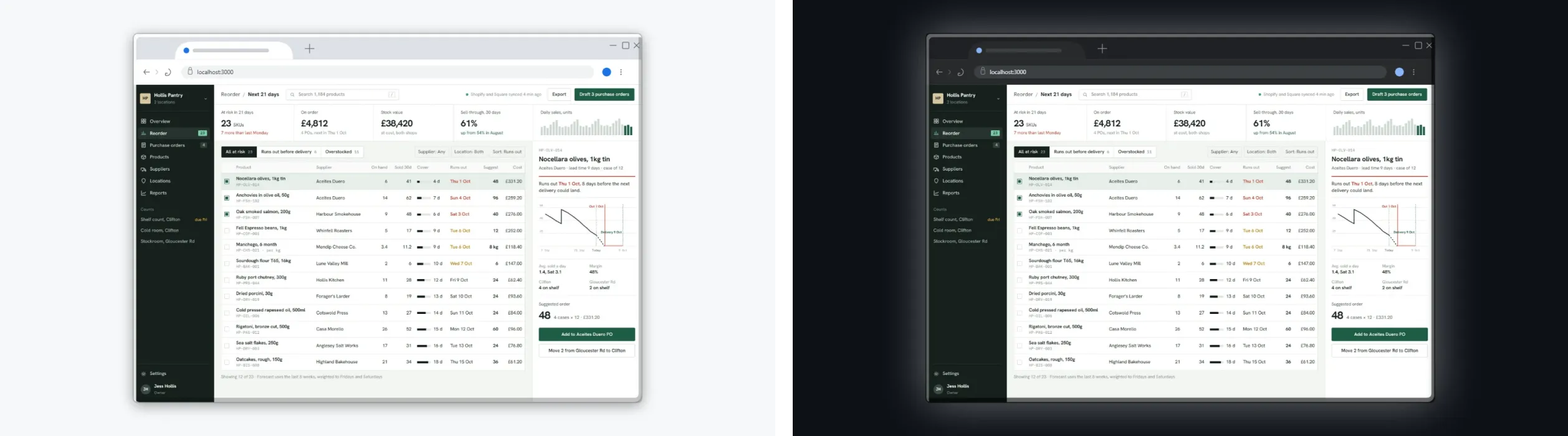
What makes a good README screenshot
- Show the thing working. The main screen with real-looking data, not an empty state.
- Crop to what matters. A whole 1440 px desktop squeezed into 800 px makes every label unreadable.
- A plain frame. A browser window with your address in the bar tells people it's a web app. Skip anything loud: a README is documentation.
- One at the top, more further down. A hero image under the title, then smaller ones next to the features they show.
- Alt text that says what it shows. "Dashboard showing low-stock items", not "screenshot".
How to make them in DudeShots
- Shot. In the studio, paste a screenshot, or capture a public URL (localhost won't work, the capture runs on our server).
- Device. Pick Browser, then Chrome light. Type your app's address in the Address bar field. Flat browsers are free.
- Backdrop. Pick Solid and set a pale grey such as #f6f8fa. For a cut-out, pick None and export PNG or WebP to keep the transparency.
- Size. Set a custom size of 800 × 450, or use 16:9 Widescreen.
- Export. PNG at 2× gives 1600 × 900.
- Dark version. Switch the browser to Chrome dark and the backdrop to #0d1117, and export again.
The browser mockup generator page has more on the browser frames, and the Open Graph guide covers the social preview image you can set for the repository itself.
Sources: GitHub Docs, "Basic writing and formatting syntax" (relative image links, the picture element and theme-specific images), checked September 2026. README column width measured on github.com at 1280, 1440 and 1920 px wide: 838 px at all three.